Mobile-first indexing: a practical checklist for your site
Google crawls and indexes websites using a smartphone crawler. Whatever your mobile page shows is what Google ranks. Here is a checklist to make sure your mobile version is not quietly hiding content.
Mobile-first indexing means Google uses the mobile version of your page, as seen by its smartphone crawler, to decide what the page contains and how it ranks. The rollout began in 2018 and is complete: Google now crawls almost all sites as a smartphone.
For responsive sites that show the same content on every screen, this changes little. For sites that trim content, hide sections or load less on mobile, it can quietly cost rankings. Here's what to check.
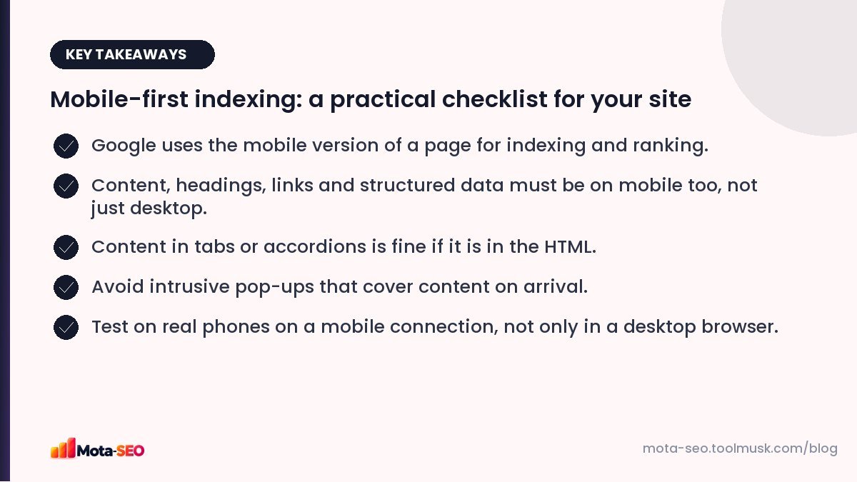
Key takeaways from this guide
1. Same content on mobile and desktop
If the desktop page has 1,500 words, a pricing table and customer reviews, but the mobile version shows a shortened intro and a "View full site" link, Google indexes the shortened version. Anything missing on mobile effectively doesn't exist for ranking.
Check:
- main text, headings and FAQs are all present on mobile,
- important images (with alt text) are present,
- internal links in the content and navigation exist on mobile too (mobile menus often drop links).
2. Tabs and accordions are fine
Collapsing content into tabs or "read more" accordions to save space on small screens is fine, as long as the content is in the HTML when the page loads. Content that only loads after a tap (fetched later via JavaScript) may not be seen.
3. Structured data and meta tags on mobile
If you run separate mobile templates, make sure they include the same title, meta description, robots tags, canonical, hreflang and structured data as desktop. Check the mobile version with the meta tags checker.
4. Readable without zooming
- A viewport tag:
<meta name="viewport" content="width=device-width, initial-scale=1"> - Body text around 16 px or larger.
- No content wider than the screen (no sideways scrolling, except deliberately scrollable tables).
Our mobile-friendly checker tests a URL for the common problems.
5. Tap targets with room to tap
Buttons and links should be big enough and far enough apart to tap without hitting the wrong one: around 48 × 48 pixels is the usual guideline. Footer links crammed together and tiny "x" buttons on banners are the usual offenders.
6. No intrusive interstitials
Google's page experience guidance discourages pop-ups that cover the main content right after someone arrives from search, especially on mobile. Cookie notices and age verification required by law are fine. A full-screen "download our app" or newsletter overlay on arrival is not; use a small banner instead.
7. Speed on a real mobile connection
Mobile visitors are often on 4G with patchy signal and mid-range phones. A page that loads in one second on office Wi-Fi can take six on the bus. Test with the website speed test and look at Core Web Vitals for mobile in Search Console. The usual culprits are large images, heavy JavaScript and too many third-party scripts; our Core Web Vitals guide explains each metric.
8. Don't block resources
Googlebot needs your CSS and JavaScript to render the mobile layout. If robots.txt blocks them, Google may see a broken page. Check with the robots.txt tester.
9. Images and video that work on mobile
- Use responsive images (
srcset) so phones download smaller files. - Don't lazy-load images that are visible at the top of the page; it delays the main content.
- Make sure videos are playable on mobile and not in formats phones can't play.
10. Separate mobile sites (m-dot)
If you still run a separate m.example.com, you need correct annotations between versions (rel="alternate" on desktop, rel="canonical" on mobile), the same content on both, and redirects that send each user to the right version. It works, but it doubles the maintenance. Moving to a responsive design is usually worth it.
How to test properly
- Open your key templates on two real phones (one mid-range Android if you can), on mobile data.
- Compare with desktop: is anything missing?
- Use URL inspection in Search Console → "Test live URL" → view the screenshot and rendered HTML from Google's smartphone crawler.
- Run the mobile-friendly and speed tests.
Most of what makes a site rank well on mobile is what makes it pleasant to use on a phone. If your own team prefers to check the site on a laptop, that's a sign to spend more time on the mobile version.
Frequently asked questions
What is mobile-first indexing?
Google uses the mobile version of your pages, crawled with its smartphone crawler, for indexing and ranking.
Is hidden content in accordions indexed?
Yes, if it is present in the HTML when the page loads. Content that loads only after a user interaction may not be seen.
Do I need a separate mobile site?
No. A responsive design that serves the same HTML to all devices is simpler and is what Google recommends.
Does mobile speed affect rankings?
Page experience, including Core Web Vitals measured on real mobile visits, is one of many signals. Speed matters even more for keeping visitors from leaving.

Written by the Mota-SEO team
We build free SEO and website tools. Our guides are practical, written for small teams, and checked against Google's own documentation.

Comments 0