Image optimisation for the web: formats, sizes and lazy loading
Images are usually the heaviest part of a web page and the easiest to slim down. Here is how to choose the right format, size and compression, and how to load images so pages appear faster.

Images make up a large share of the bytes on a typical web page. On slow sites, a single oversized photo is often responsible for most of the load time. Fixing images is the closest thing to a free speed upgrade.
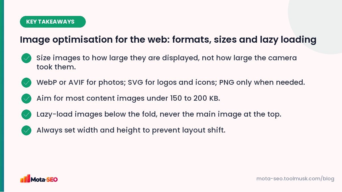
Key takeaways from this guide
Step 1: Choose the right format
| Format | Best for | Notes |
|---|---|---|
| WebP | Photos and graphics | Supported by all modern browsers; usually much smaller than JPG at similar quality. |
| AVIF | Photos | Even smaller than WebP in many cases; encoding is slower; broad modern browser support. |
| JPG | Photos (fallback) | Universal. Quality 75–85 is usually indistinguishable from 100. |
| PNG | Screenshots, graphics needing transparency or sharp text | Very large for photos. Don't use for photographs. |
| SVG | Logos, icons, simple illustrations | Tiny and sharp at any size. Not for photos. |
| GIF | Almost nothing today | For animations, a short MP4 or WebP is far smaller. |
Step 2: Resize to the display size
A phone camera photo might be 4,000 × 3,000 pixels. If it's shown in a 800-pixel-wide column, the browser downloads five times more pixels in each direction than it needs. Resize before uploading:
- full-width hero images: around 1,600–2,000 px wide,
- content images in an article column: 1,200 px wide is plenty (enough for high-density screens),
- thumbnails: their actual displayed size, doubled for sharp screens.
Our image resizer works in the browser, so files never leave your computer.
Step 3: Compress
Compression removes detail your eye won't notice. As a rough guide, most content images can be under 150–200 KB and hero images under 300 KB without visible loss. Check a few at full size after compressing; if you can't see a difference, compress a bit more.
Step 4: Serve the right size to each device
Responsive images let the browser pick a file that fits the screen:
<img src="sofa-1200.webp"
     srcset="sofa-600.webp 600w, sofa-1200.webp 1200w, sofa-1800.webp 1800w"
     sizes="(max-width: 700px) 100vw, 700px"
     width="1200" height="800"
     alt="Grey three-seater sofa with wooden legs">
WordPress generates srcset automatically for images in content. On custom sites, image CDNs or build tools can produce the sizes for you.
Step 5: Lazy-load below the fold
Add loading="lazy" to images further down the page; the browser loads them as the user scrolls. But don't lazy-load the first image a visitor sees, such as the hero banner or the main product photo. That delays your Largest Contentful Paint. For that image, use fetchpriority="high" instead.
Step 6: Always set width and height
When the browser knows an image's dimensions before it downloads, it reserves the space and the text doesn't jump when the image arrives. Missing dimensions are a top cause of poor CLS; see Core Web Vitals explained.
Image SEO while you're at it
- Descriptive file names:
grey-three-seater-sofa.webp, notIMG_20260412_101532.jpg. - Alt text that describes the image in context; see our alt text examples and check pages with the image alt checker.
- Relevant surrounding text: captions and nearby paragraphs help Google understand images.
- Don't put important text inside images; search engines read HTML text far better.
Your own photos beat stock photos
Optimisation makes images fast; it doesn't make them useful. A product shot taken in your own workshop, a photo of your team at a real job, or a screenshot from your own dashboard tells visitors something a stock image can't: that you actually do this work. Google's guidance on helpful content puts weight on first-hand experience, and original images are one of the simplest ways to show it. Our guide to E-E-A-T for small websites explains why that matters.
Practical tips for phone photos: shoot in daylight, keep the background tidy, take several angles, and resize and compress before uploading, as described above.
Small images: inline or not?
Very small icons can be inlined as Base64 or SVG code to save a request, which is what our image to Base64 converter is for. Don't do it for larger images: Base64 makes files about a third bigger and they can't be cached separately.
A quick audit of your own pages
- Run a key page through the speed test and list the largest images.
- For each, check: displayed size vs file dimensions, format, file size.
- Fix the top three. Re-test.
- Set up a habit, or a plugin, so new uploads are resized and compressed automatically.
On image-heavy sites such as shops, portfolios and real estate listings, this single exercise often cuts page weight by more than half.
Frequently asked questions
What is the best image format for websites?
WebP for most photos and graphics, with AVIF as an even smaller option. Use SVG for logos and icons, and PNG only for images that need it, like screenshots with transparency.
How big should website images be in KB?
As a rough guide, most content images under about 150 to 200 KB and hero images under about 300 KB, after resizing to the displayed size.
Should I lazy-load all images?
No. Lazy-load images below the fold, but load the main image at the top of the page immediately, or it will slow down how fast the page appears.
Does image optimisation help SEO?
Yes. Faster pages improve page experience, and good file names and alt text help images rank in Google Images.

Written by the Mota-SEO team
We build free SEO and website tools. Our guides are practical, written for small teams, and checked against Google's own documentation.


Comments 0